ARCHITECTURE & INTERIORS · WEBSITE
OSSATURE
Material.
Proportion.
Light.
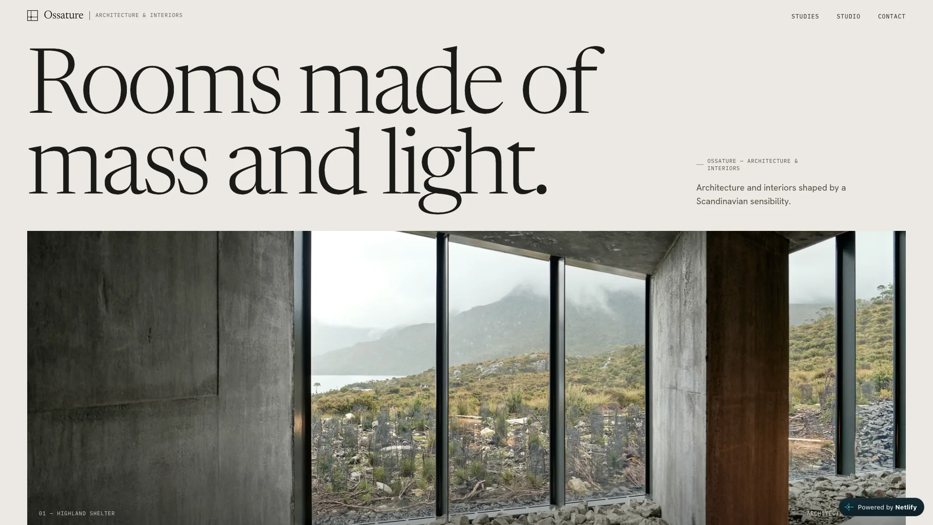
An architectural website shaped around material and light.
Photography sets the scale. Typography gives it structure.
Art Direction &
Creative Development
Let the room
set the rhythm.
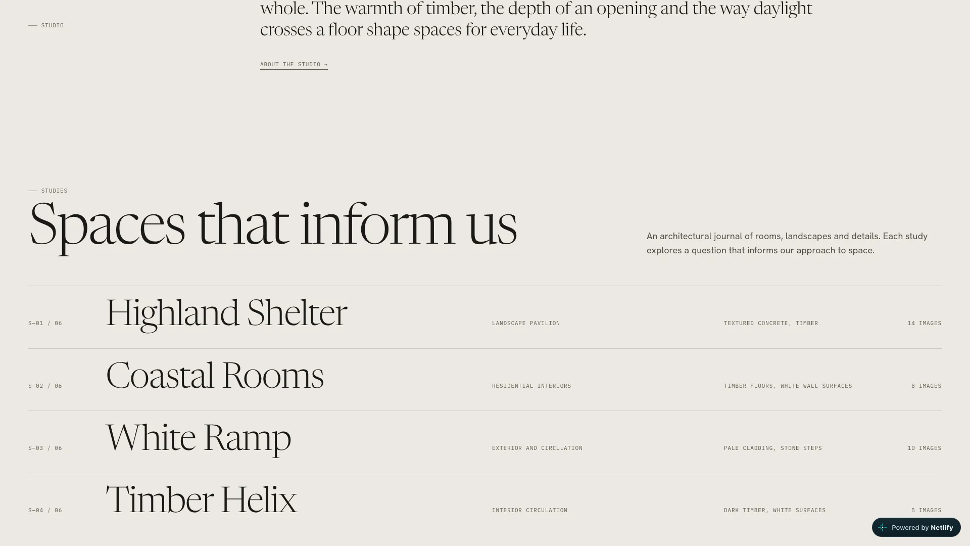
A warm paper palette, generous photographic fields and a clear typographic hierarchy. The homepage moves from a single space to a journal of rooms, landscapes and details.
Video playback is unavailable. Explore the live website.
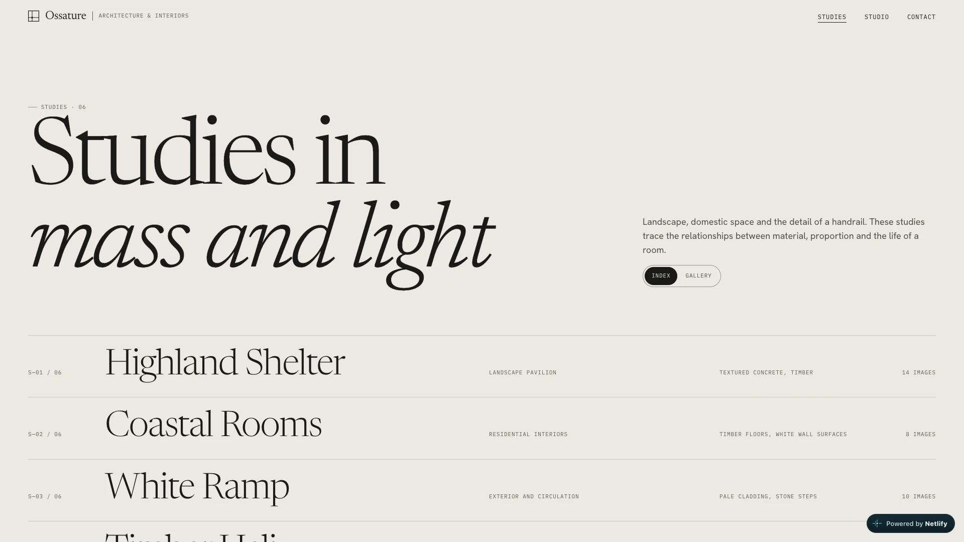
An index to read.
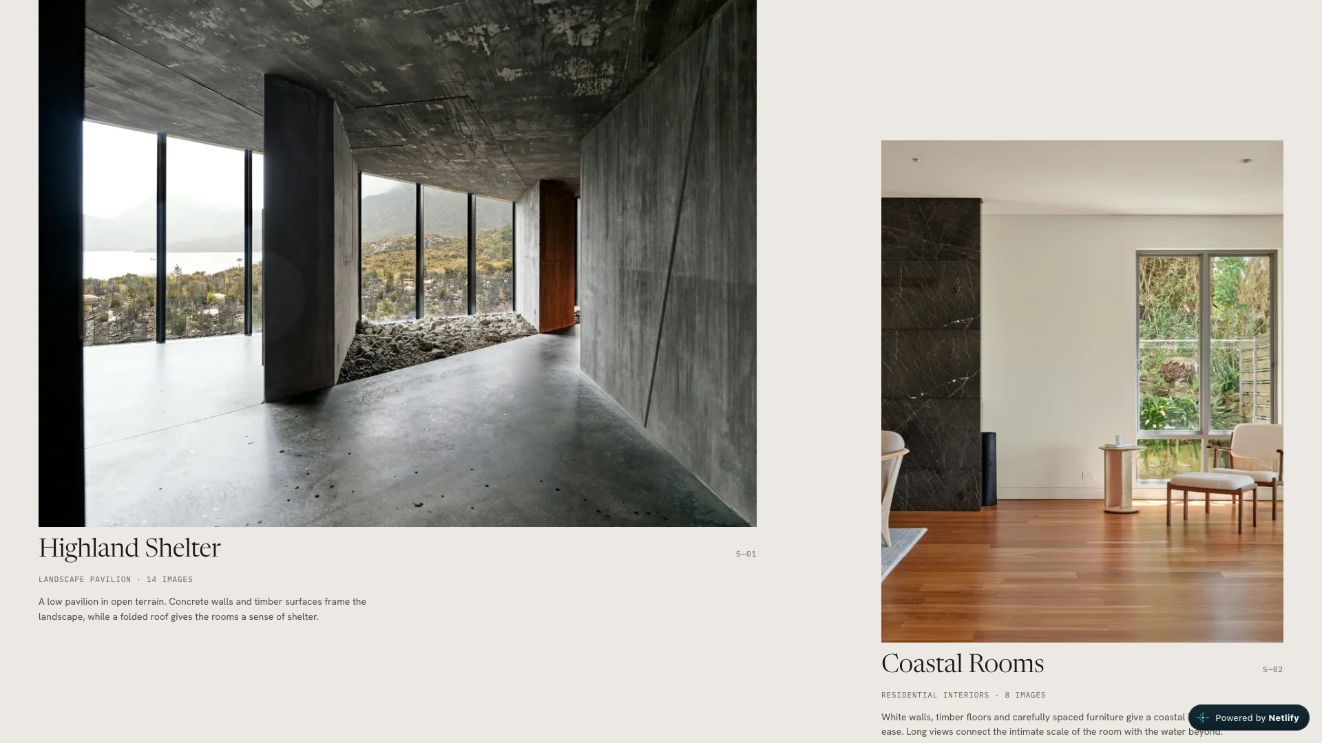
A gallery to explore.
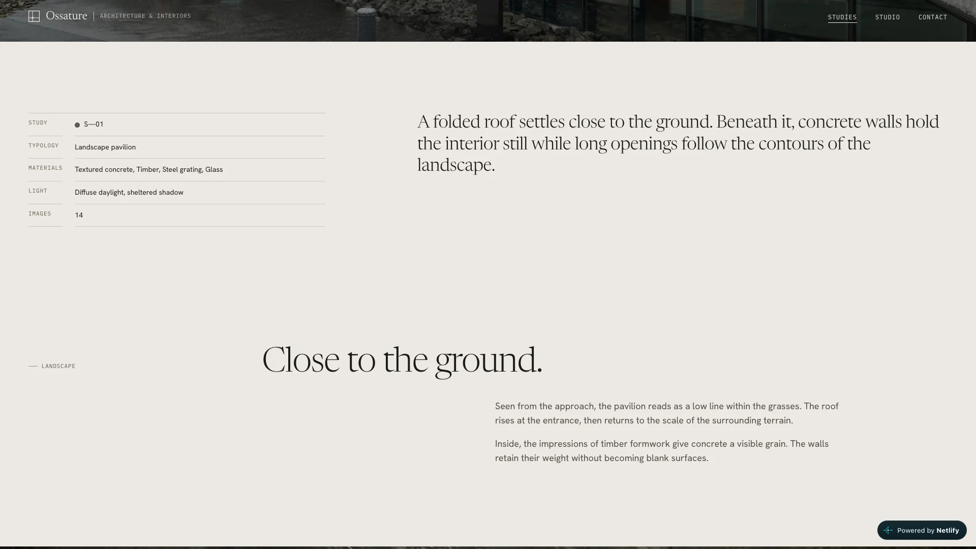
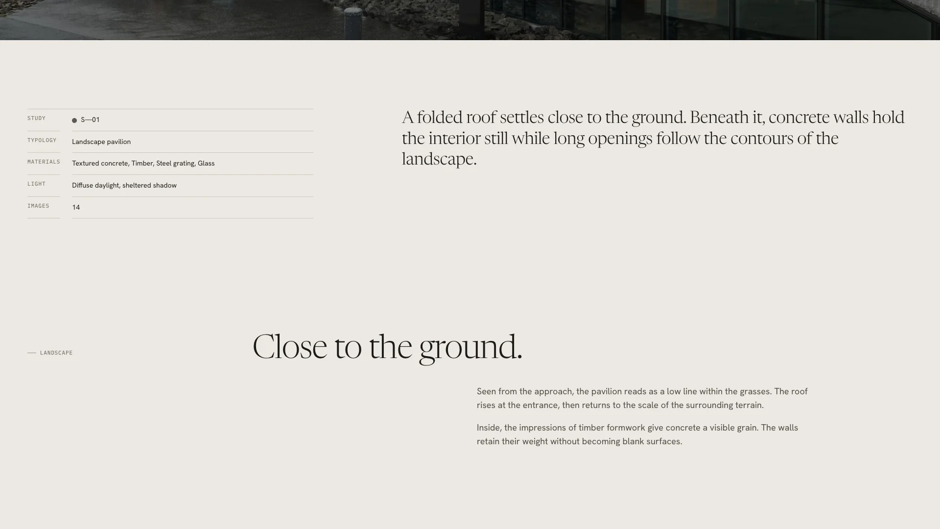
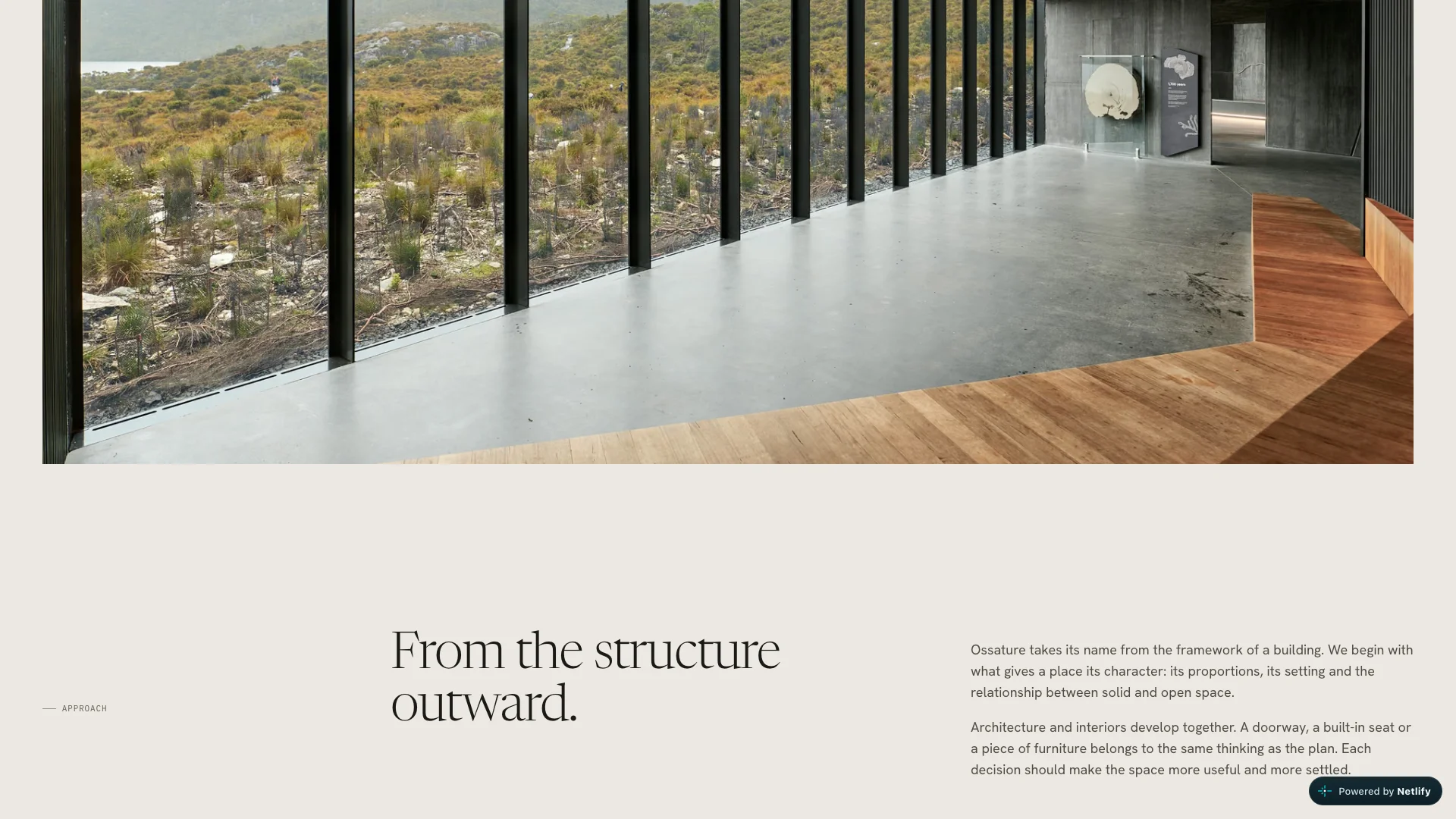
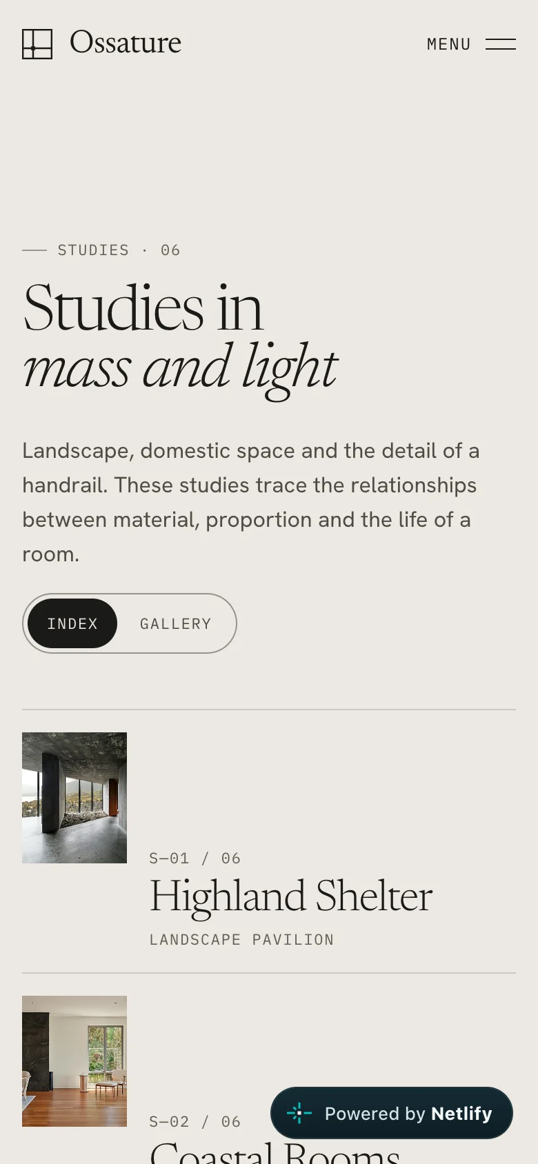
Six studies are arranged as ruled rows or an image-led gallery. Cursor previews offer a first glimpse; each study opens into its own photographic sequence.
The same attention.
In your hand.
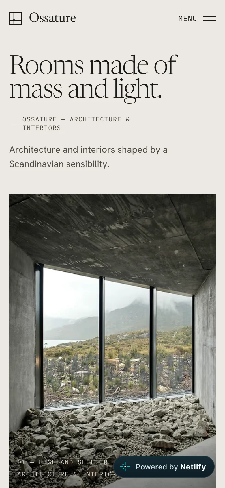
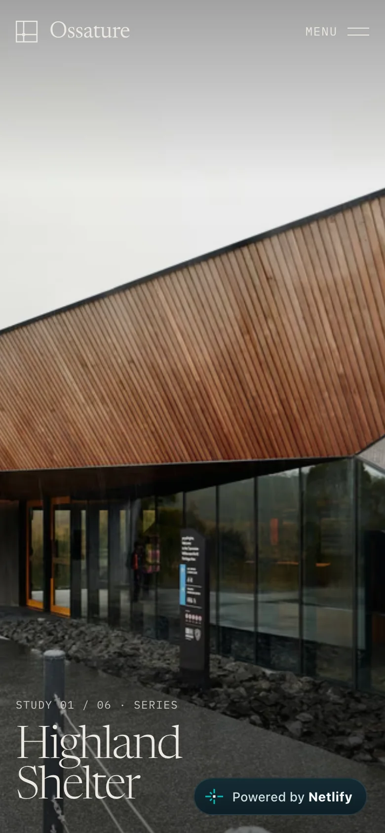
The composition adapts to a narrow screen. The opening, study index and individual pages keep their hierarchy, with touch navigation and room for the photography.
OSSATURE
Art Direction & Creative Development
Sacha Wicky
Reference spaces, presented as an architectural journal.
Image credits on the live website